Tween UI
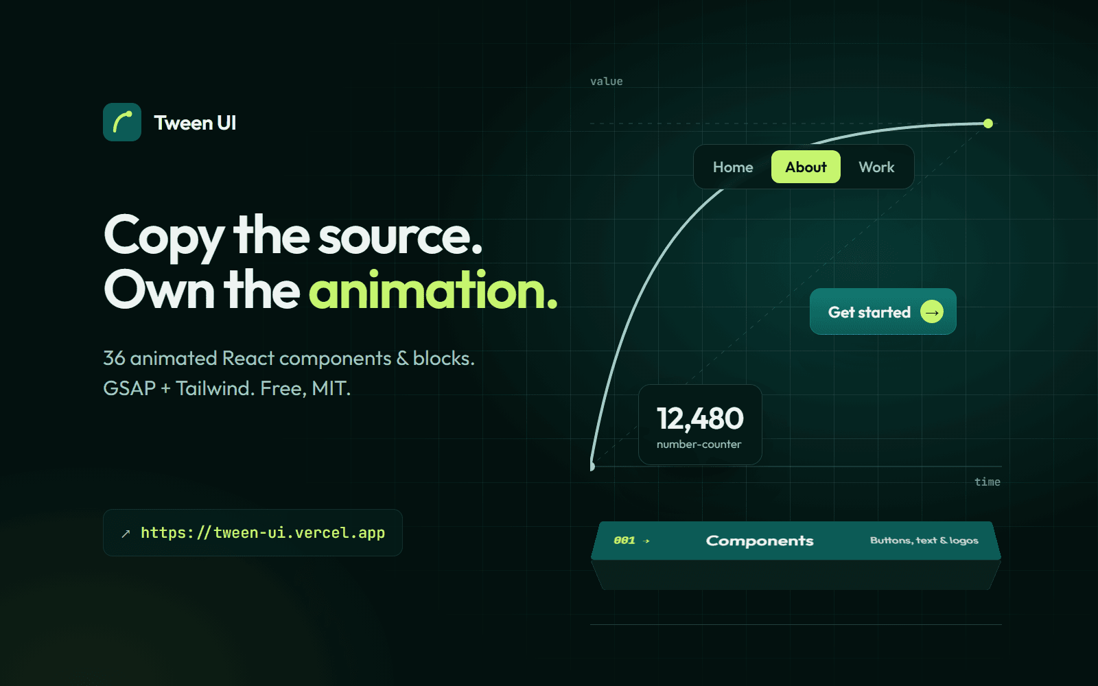
An open-source library of animated React components and blocks built with GSAP and Tailwind CSS. Copy the source and own the animation.
The challenge
At work I kept building the same kinds of GSAP interactions: clip-path reveals, 3D tilts, layout-shift-free state changes. No open-source library offered them in a form I could drop into a React project and still fully control.
Most animated component libraries hide the animation inside a package. The moment you need to change the timing or the easing, you are fighting the library instead of using it.
The approach
Tween UI follows the copy-the-source model: every one of its 36 components and blocks is a file you paste into your project and own. Nothing animated is hidden behind an import, and it is free under the MIT licence.
- GSAP for the motion, so timelines, easing and scroll triggers behave the same everywhere.
- Tailwind CSS for the styling, so the look is easy to change without touching the animation.
- Built and documented solo, from the first component to the docs site.
What I learned
Building for strangers is different from building for a client: every prop name and every default has to explain itself.
Signed & shipped